UX Audit
To gain a solid understanding of the task at hand, I conducted a UX audit of the existing Repository website. The site had an appealing design, which is important since good design that is user-friendly creates trust with users.
However, the UX of the website was complex and did not align with users’ heuristics, especially the search experience.
The search experience made it hard for users to find the most “relevant” document expected from the search query across all records in the repository. This was detrimental, since one of the most important features of a repository is to be able to find information as easily as possible.
“The search function is bad, it is extremely hard to find articles and PhD thesis that previously were very easy to find” - Survey open response


Problem definition & UX KPIs
Based on the aforementioned research methods, the project faced the challenge of redesigning the search experience to meet users expectations. The central challenges included:
Increase user satisfaction: Ensuring that the CSAT score increased from 21% to at least more than 60%
Showing expected results: Improve search experience through the search bar by showing the expected results on at least the second row.
Reduce search time & cognitive load: Reduce time spent searching and try to implement search automation to reduce cognitive load.
The goal was to create a solution that not only meets the needs of the direct users but also fundamentally improves the convenience, efficiency, and accessibility of the TU Delft research.
Improving search algorithm with back-end developers
I collaborated closely with back-end developers to help build an open-source search engine. To improve its effectiveness, I collected and analyzed search logs to identify user preferences when navigating the repository. Leveraging large language models (LLMs), I gained deeper insights into user search behavior. Based on these findings, I worked with the development team to implement targeted improvements in the search engine.


Concept development
Building on the insights from the user research stage, I applied user-centered design principles to the redesign of the institutional repository. Guided by findings from user research and usability testing, I focused on resolving specific issues that hindered search efficiency, such as unclear filtering options, overwhelming result presentations, and inconsistent metadata.
Information architecture and user flows
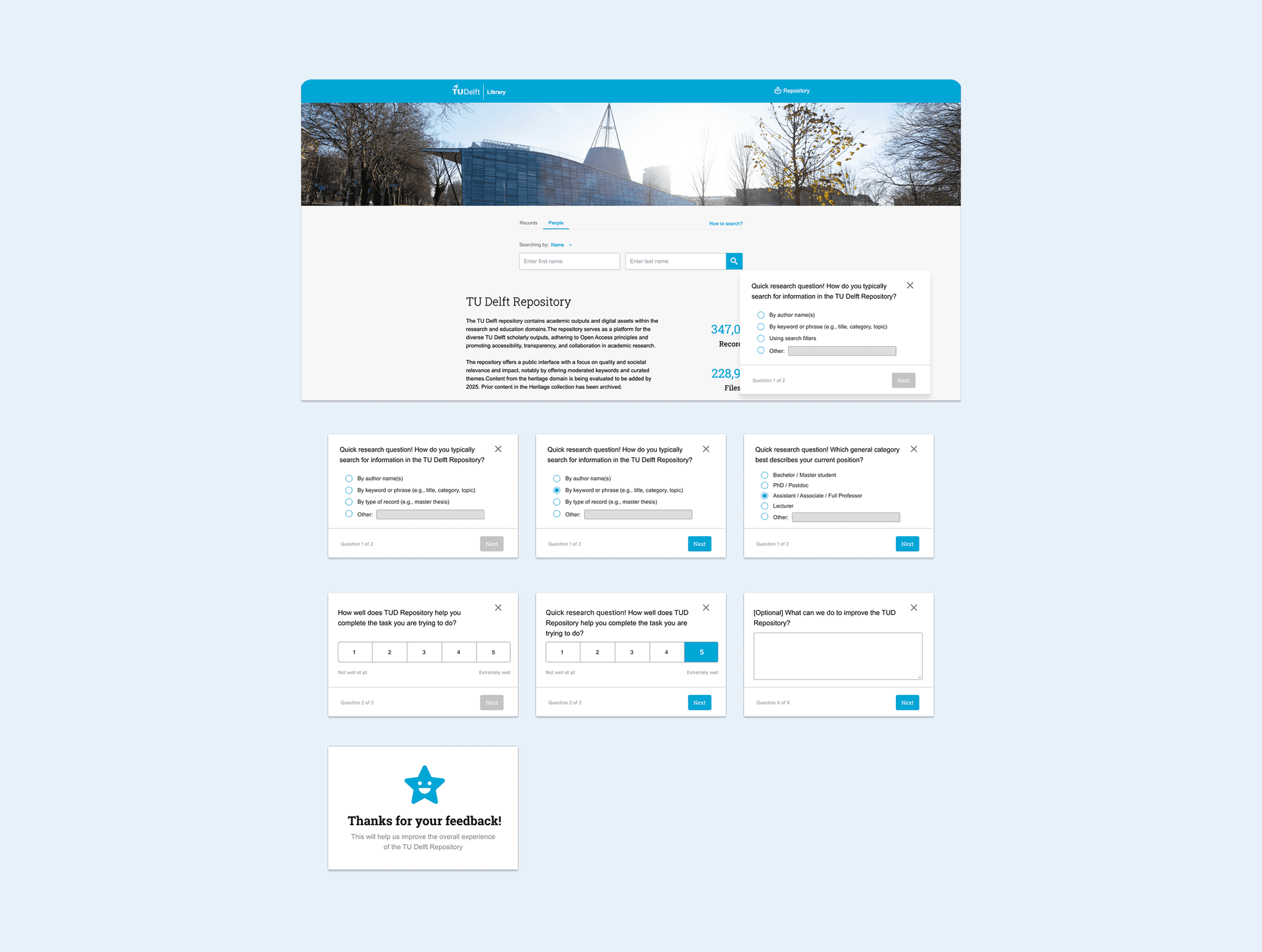
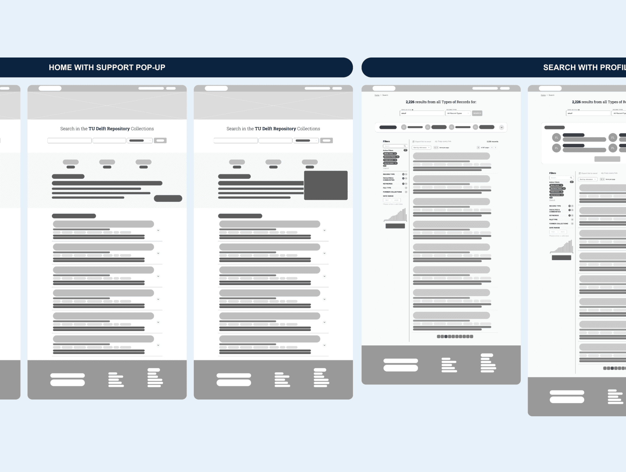
When I joined the TU Delft Library, there was no information architecture or user flows for the public site of the repository. Nothing was mapped out. I had to start from scratch. I began by figuring out what types of users would visit the site and what they needed to do. Then I organized the content into clear sections, like collections, research, authors, and help. I kept it simple so people could find things fast. After that, I created user flows to show how someone would move through the site, from searching for a paper to downloading it, or from browsing collections to contacting support. Every step had to make sense and lead somewhere useful. I tested the flows with real users to catch anything confusing. Once everything felt solid, I documented the structure and shared it with the team.


UI Design process
In the design process, the focus was on creating a visually appealing and user-friendly interface that offers users an intuitive experience. Various design elements were carefully selected to convey a clear brand identity while maintaining a focus on accessibility, usability, and functionality.
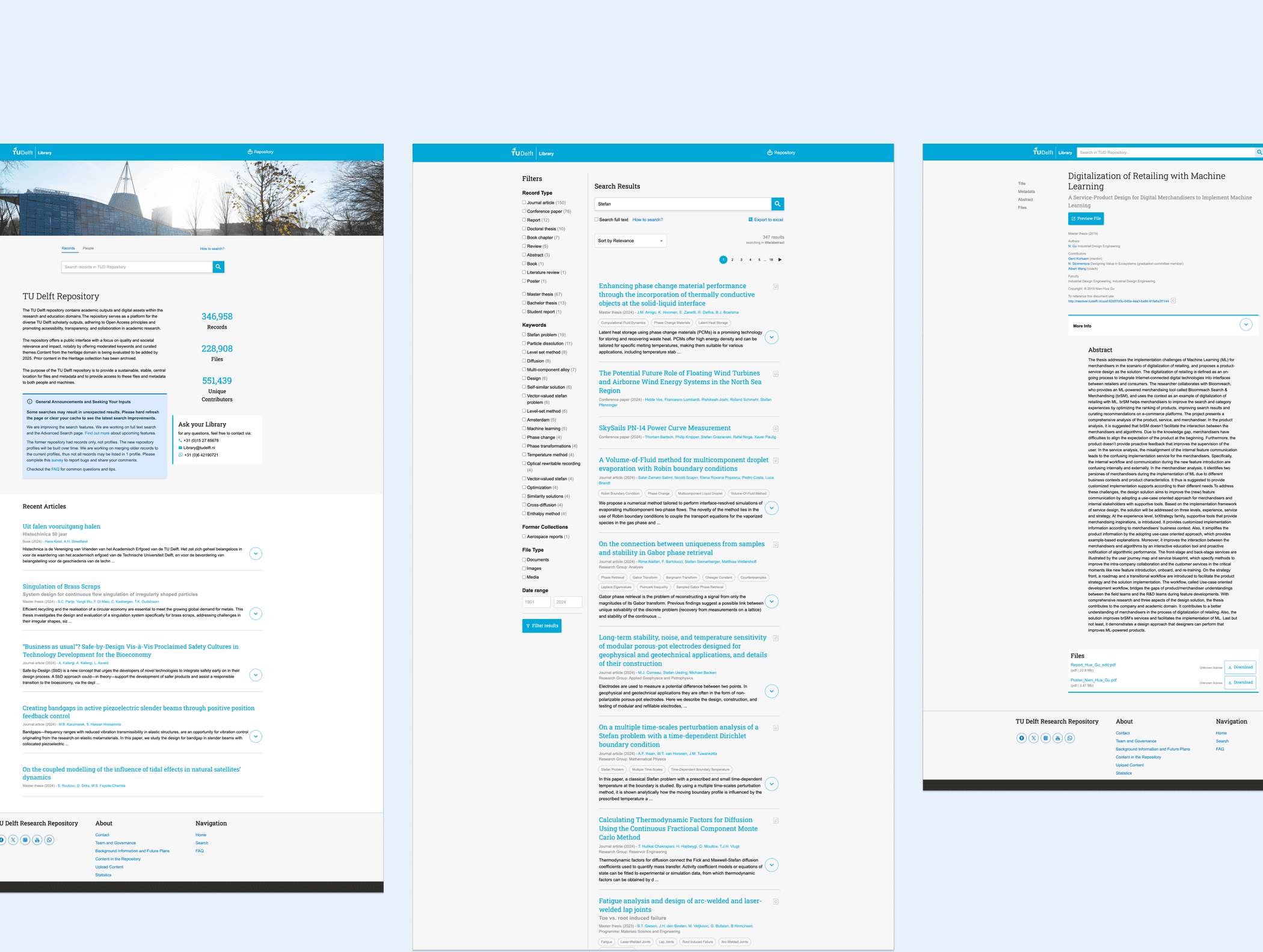
I implemented a cleaner and more responsive interface, introduced more intuitive filtering and sorting mechanisms, and enhanced the consistency and visibility of metadata. These improvements streamlined user interactions and made it easier for users to locate and access relevant resources, resulting in a more seamless and satisfying search experience.
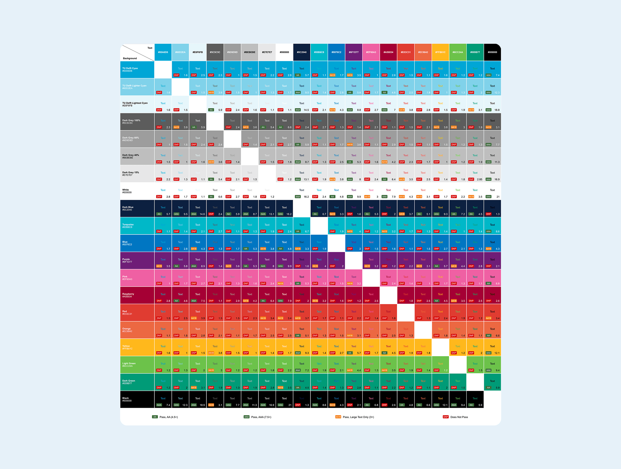
Accessibility first
Part of this project also included making the TU Delft repository more accessible by fixing color contrast. TU Delft uses a shade of cyan and white as main colors. But that combination doesn’t meet WCAG AA or AAA contrast requirements, especially for text. I made a contrast matrix to show the communications team exactly where the problems were. The matrix compared different text and background combinations and marked which ones passed or failed. This helped make it clear that some of the default color choices weren’t accessible. The goal wasn’t to change the TU Delft brand, but to show how we could work within it and still meet AA and AAA guidelines.
Usability testing for validation
Once a stable design concept of the repository website was deployed in our testing environment, I conducted a Rapid Iterative Testing and Evaluation (RITE) study. Initially, I tasked three participants with locating specific academic papers using the repository's search feature. My preliminary observations revealed that users struggled with ambiguous filter labels (no “active filters” tags were shown) and an unintuitive layout.
I classified this issue as Category A, problems with clear causes and straightforward solutions that could be quickly implemented. Consequently, the development team and I revised the filter labels and adjusted the layout to improve clarity.
A subsequent round of testing with two new participants showed improved navigation and task completion rates, with no new significant usability issues identified. This iterative process ensured that the search experience was refined efficiently.


Reducing search time (through UX)
Reducing search time was a key goal in the UX redesign of the TU Delft Repository. I added a pre-filter directly in the search bar, based on what I learned from user research. This helped users narrow results faster, right from the start. I also added an author profile preview, so users could quickly see who wrote what without leaving the results page. To make date-based searches easier, I built an interactive filter-by-date widget that let users select a range without reloading the page. On top of that, I reworked the filter hierarchy so the most useful options appeared first. Together, these changes made it faster and easier to find specific content.
Final Impact and Learnings
Over a period of 5 months, with a new search improvement launching every few weeks, we achieved a CSAT increase from 21% to 70%.
Search time of TU Delft research output decreased by 50%.
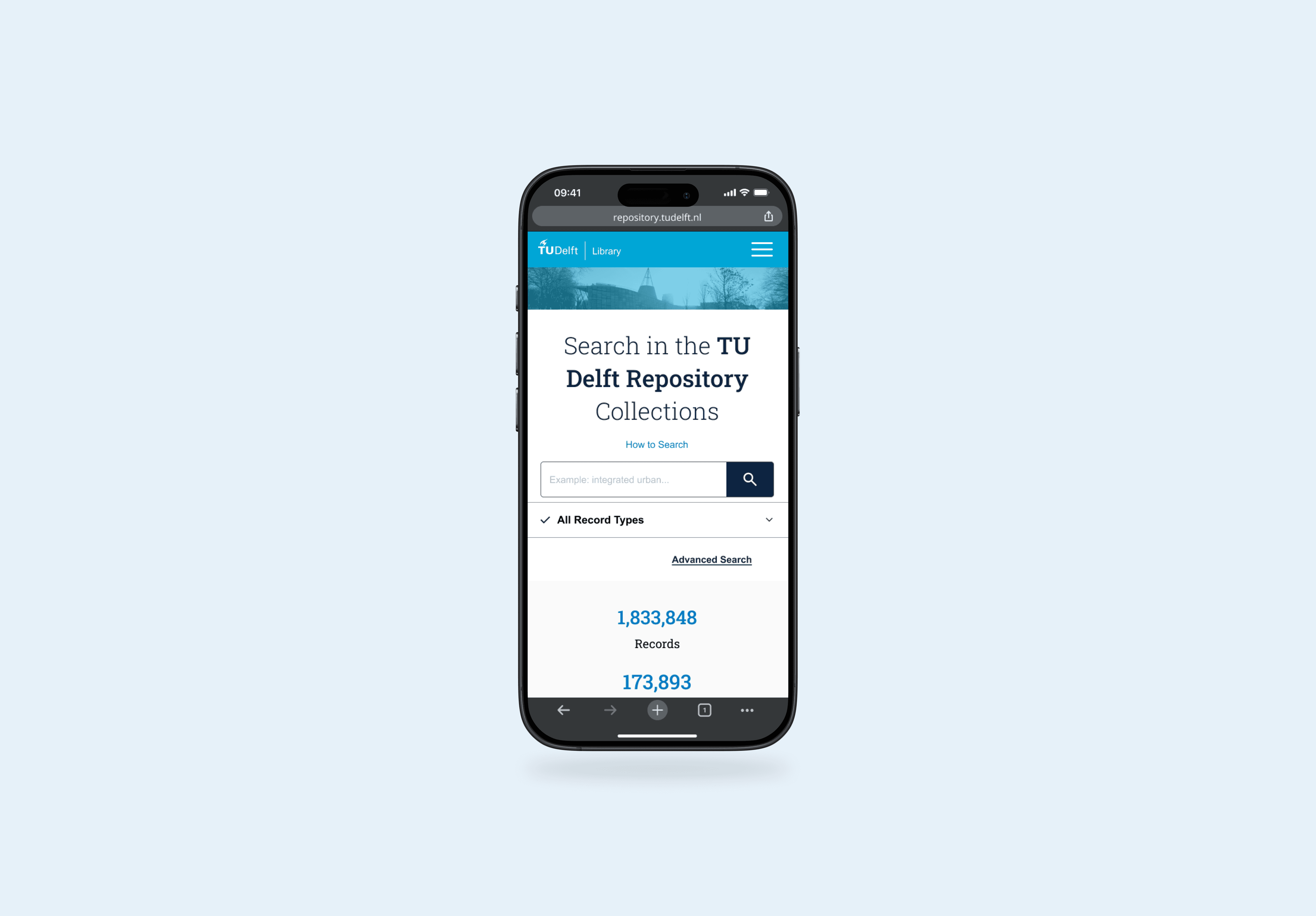
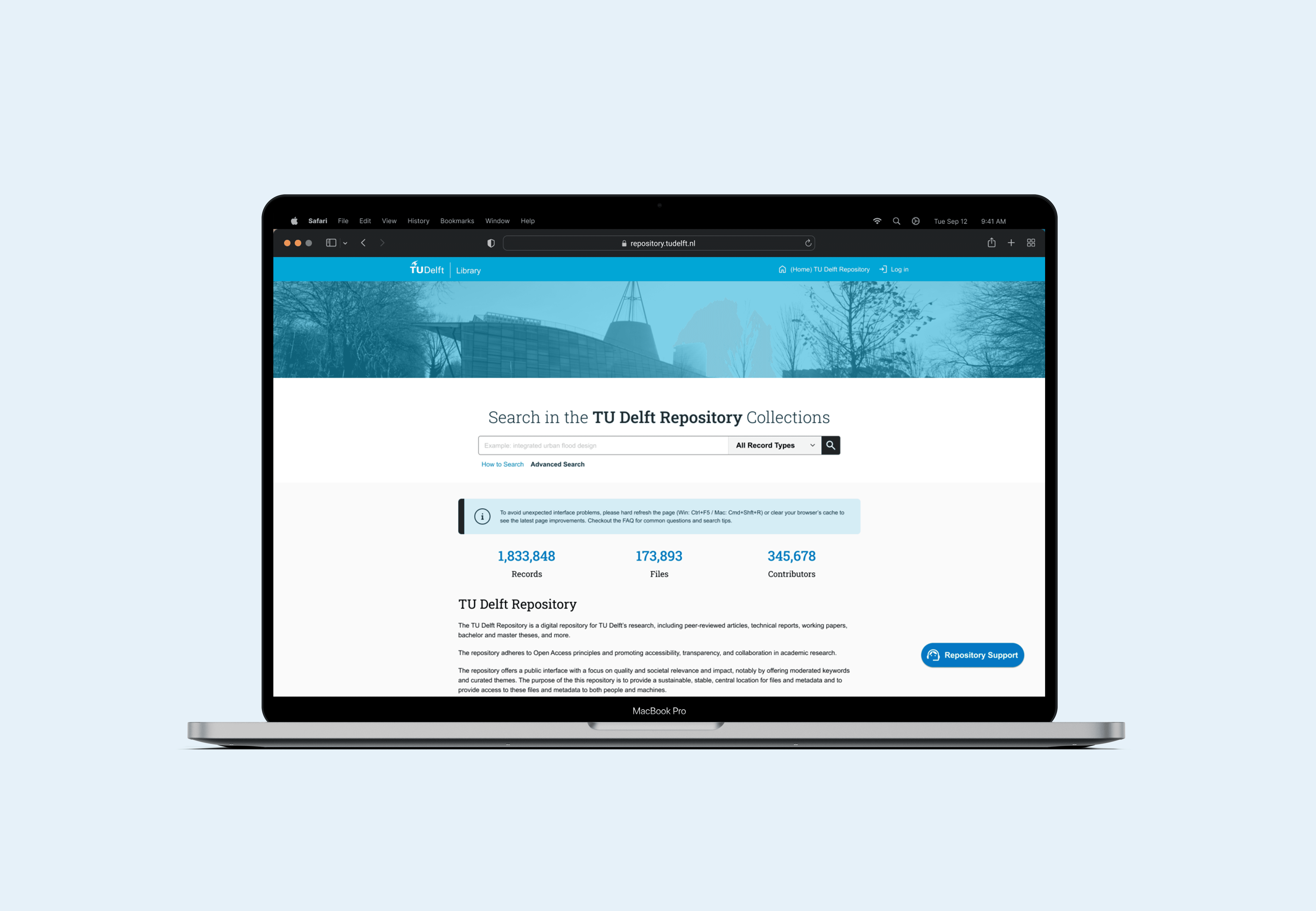
As part of the search improvement strategy, I designed a new search bar and homepage that respected the initial design aesthetics. The goal was to modernize the visual aesthetic while keeping the vibrant TU Delft colors and brand.
The resulting design solution featured a tab system and a pre-filter dropdown that included all record types, such as master theses and student reports.
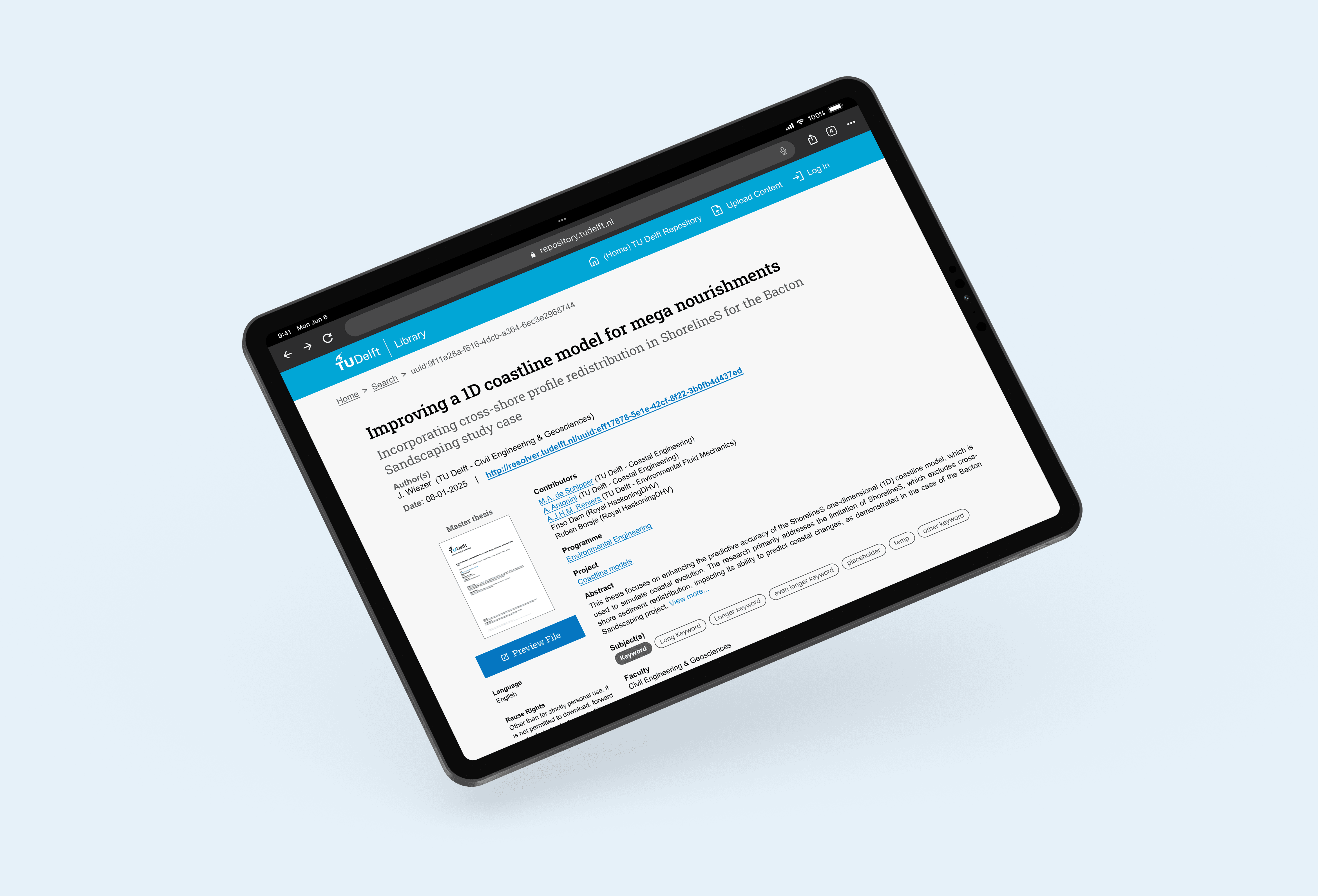
I also redesigned other several screens from the TU Delft Repository public site like the 'Record View' and 'FAQ' pages.
The final design featured a responsive mobile version of the Repository web application.